
What exactly are these data?
The data presented for each species are based on counts made by community scientists that visit specific locations each June.
They are not the actual counts, however.
The numbers that we show have been adjusted to account for birds that were present during the survey but not detected. It sounds like a bit of statistical magic, but in fact these corrections are a standard practice that reduces bias and increases the accuracy of population estimates. We use different correction methods for data collected in 2001-2010 and in 2011-2016.
Why are data from the early years of Mountain Birdwatch treated differently?
Mountain Birdwatch received a major overhaul in 2010. We changed the survey methods, added new survey locations, and eliminated some of the old ones. It was such an upgrade that we started calling it Mountain Birdwatch 2.0. As a consequence, the results from 2001-2010 are not directly comparable with those from 2011 onwards.
The original Mountain Birdwatch survey protocol consisted of 5 minutes of quiet listening at each survey location. In 2003, the count period was extended to 10 minutes.
Mountain Birdwatch 2.0 employs a more complicated protocol that offers much greater flexibility when it comes to data analysis. One of the main differences is that counts last for 20 minutes and are subdivided into 4, 5-minute intervals.
How should I interpret the results for each species?
The key result for each species is presented in the two graphs, one showing the results from 2001-2010 and the other showing the results from 2011-2016. Because of differences in how the surveys were conducted and in how we analyze the resultant data, the two figures present slightly different information:
- Mountain Birdwatch 1.0 results are presented as the average number of individuals counted per survey.
- Mountain Birdwatch 2.0 results are presented as the total number of individuals present in the area surveyed.
Although the numbers in the two figures are not comparable, we can still evaluate long-term trends.
How do I read the graph of results for each species?
Just remember that even though the results from Mountain Birdwatch 1.0 and Mountain Birdwatch 2.0 are presented on different scales, they measure the same thing: do populations appear to be growing, shrinking, or remaining about the same size?
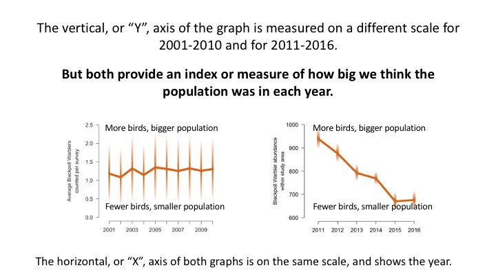
The higher the position of data points on the vertical axis, the more individuals we think were alive and living in the mountains in that year. The lower the position of data points on the vertical axis, the fewer individuals we think were alive and living in the mountains in that year.
Graphs that show a flat line (above, left) indicate a population that wasn’t changing much. The vertical position of data points doesn’t show any trend over time. Natural populations tend to fluctuate each year, so some degree of up-and-down is expected. A graph that shows no obvious trends is an encouraging result, as it suggests that population numbers were stable.
Graphs that show a line dropping from left to right (above, right) indicate a population that is getting smaller each year. The vertical position of data points on the graph get lower and lower each year. This is a potentially worrying result, as it might indicate a population in trouble. However, natural fluctuations in population size can produce this kind of short-term trend, so it is always better to draw conclusions using data collected over many years.
Graphs that a show a line increasing from left to right indicate a growing population. The vertical position of data points on the graph get higher and higher each year. As with a declining population, this might reflect natural fluctuations in population size. It might also reflect a long-term positive change in the environment that is allowing more individuals of that species to survive and reproduce in our mountains.